Mapping the Terrain
Intro to Computational Semiotics: Part Four
Mar 2026
The fourth article in a 6-part series on "Intro to Computational Semiotics" lectures by Brandon Duderstadt—formerly founder of Nomic AI, now CEO of Calcifer Computing. Follow him at @calco_io on X.
In Part Three, I wrote in detail about how transformers and embedding models work mechanistically. My core argument was that we make consequential semiotic decisions when we train models on meaning. I ended with the question, "How do we take high-dimensional meaning-spaces and make them visible?"
The answer is: Information Cartography.
Defining the Problem Space
In this lecture, Brandon says that Information Cartography is the topic that originally got him into computational semiotics. You can watch the lecture recording here.
The problem we are solving with Information Cartography is that we now have embedding models that can convert massive collections of data into high-dimensional vectors (where proximity corresponds to similarity of meaning), but a matrix with six million rows and 768 columns is not something a human can really look at.
You can't put 768 dimensions on a screen; you can put two, maybe three. So you need some way to take that high-dimensional structure and flatten it down to something that you can actually look at and make sense of visually.
Why do we care? Because looking at data is one of the most important things you can do with it. Patterns that resist detection sometimes become obvious the moment you plot the data and look at it.
The datasets we work with now—often including millions of unstructured documents, images, and audio—are fundamentally different from the small tabular datasets upon which we developed our standard visualization techniques. Information Cartography is the current best practice for solving this challenge.
Alfred Korzybski has a famous line: "The map is not the territory." In information cartography, it's important to recognize that we are dealing with a double abstraction. An embedding model translates human culture into a 768-dimensional space, and then a projection algorithm squashes that space onto a flat screen. We are not mapping raw reality. We are looking at a map of a map.
I. The Pipeline
The information cartography pipeline has four stages:
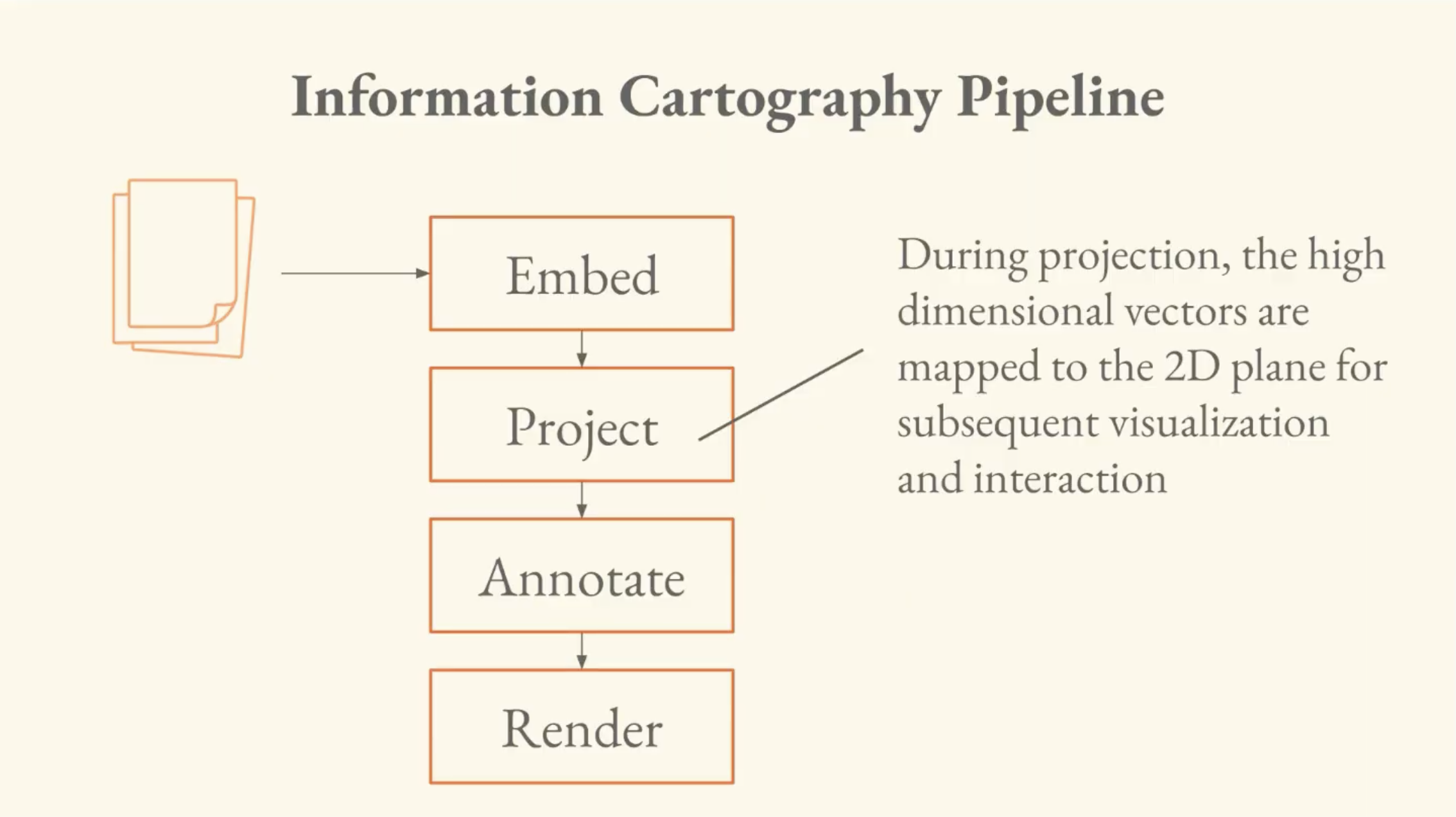
- Embed: unstructured data is converted to high-dimensional vectors.
- Project: the high-dimensional vectors are mapped to the 2D plane.
- Annotate: compute enrichments of the data; clusters and LLM-inferred labels.
- Render: take the information from projection/annotation and convert to pixels that the user can see and interact with.
Brandon says his former advisor at Hopkins, Josh Vogelstein, hammered home this idea:
"The first thing that you need to do when you get a data set is just look at it. Plot it. Look at it. Explore it. Try to get a sense of what's in it."
He gives an anecdote of talking with someone in the class about looking for a pattern in brain data, trying to surface it algorithmically, when it turned out that visualizing the data was what surfaced the pattern. "It became trivial when I looked at it."
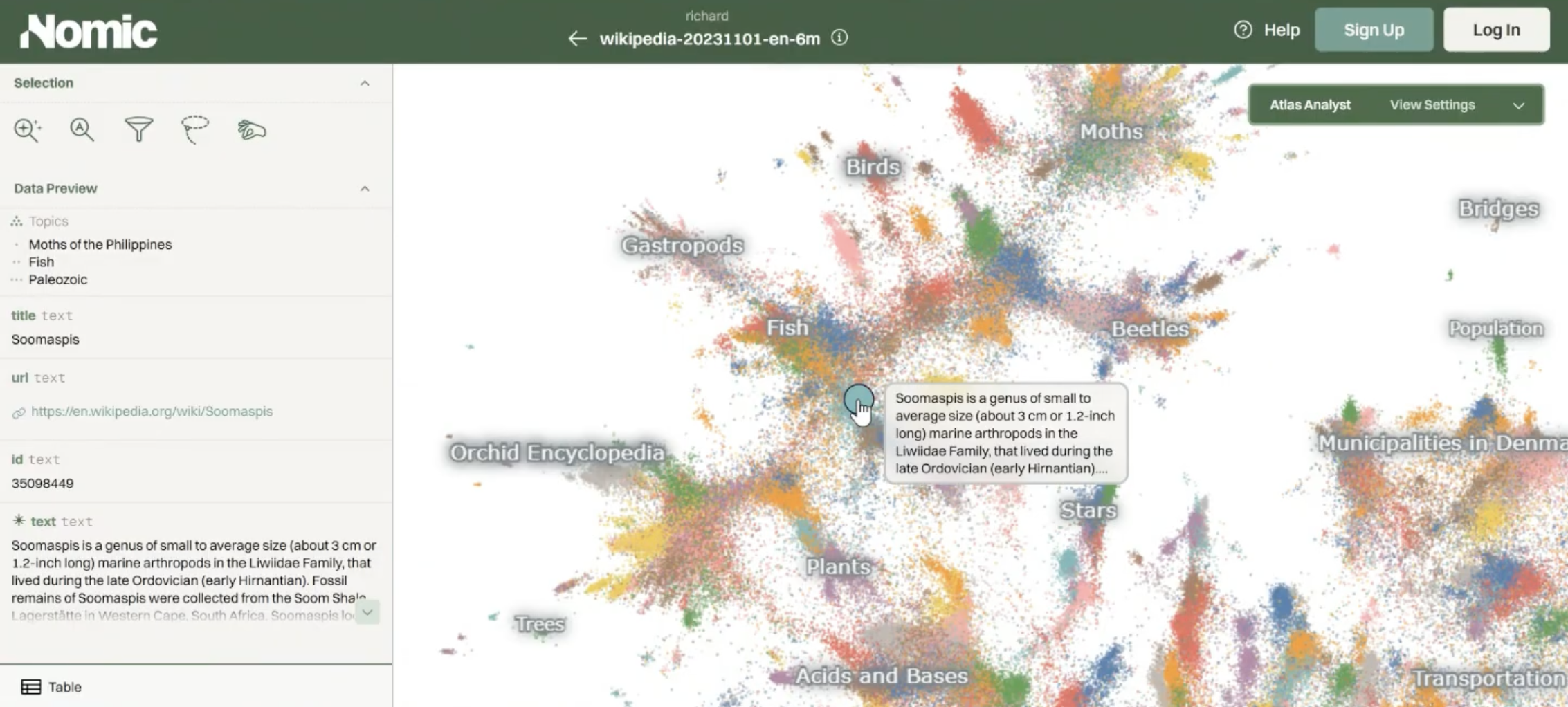
To show us what an example actually looks like, Brandon pulls up a Nomic Atlas map of all of English-language Wikipedia. It's about six million points, where every point is an article, and two points are close if their articles are about similar things.
It's a map of a particular language-form in meaning space. You can zoom into a region revealing a gradient from orchids and trees through gastropods and moths. You also get LLM-generated topic labels that help you navigate it. This is an example of the output of this pipeline.
II. Projection — The Linear Baseline and Its Limits
The simplest way to do projection is called PCA (Principal Component Analysis). You find the directions in your data with the most variance, and project onto those.
If you remember SVD and optimal linear projection from the previous lectures, PCA is equivalent to SVD on centered data. This is the same operation that solved the linear autoencoder in Part Two.
The problem is that PCA on real high-dimensional data produces what Brandon calls the eigenspoke problem. High-dimensional language embeddings often contain many distinct, mutually orthogonal concepts. When PCA tries to squash 768 dimensions of uncorrelated concepts into a 2D visualization, the data ends up axis-aligned to the first two principal components, and the chart looks like a capital letter L.
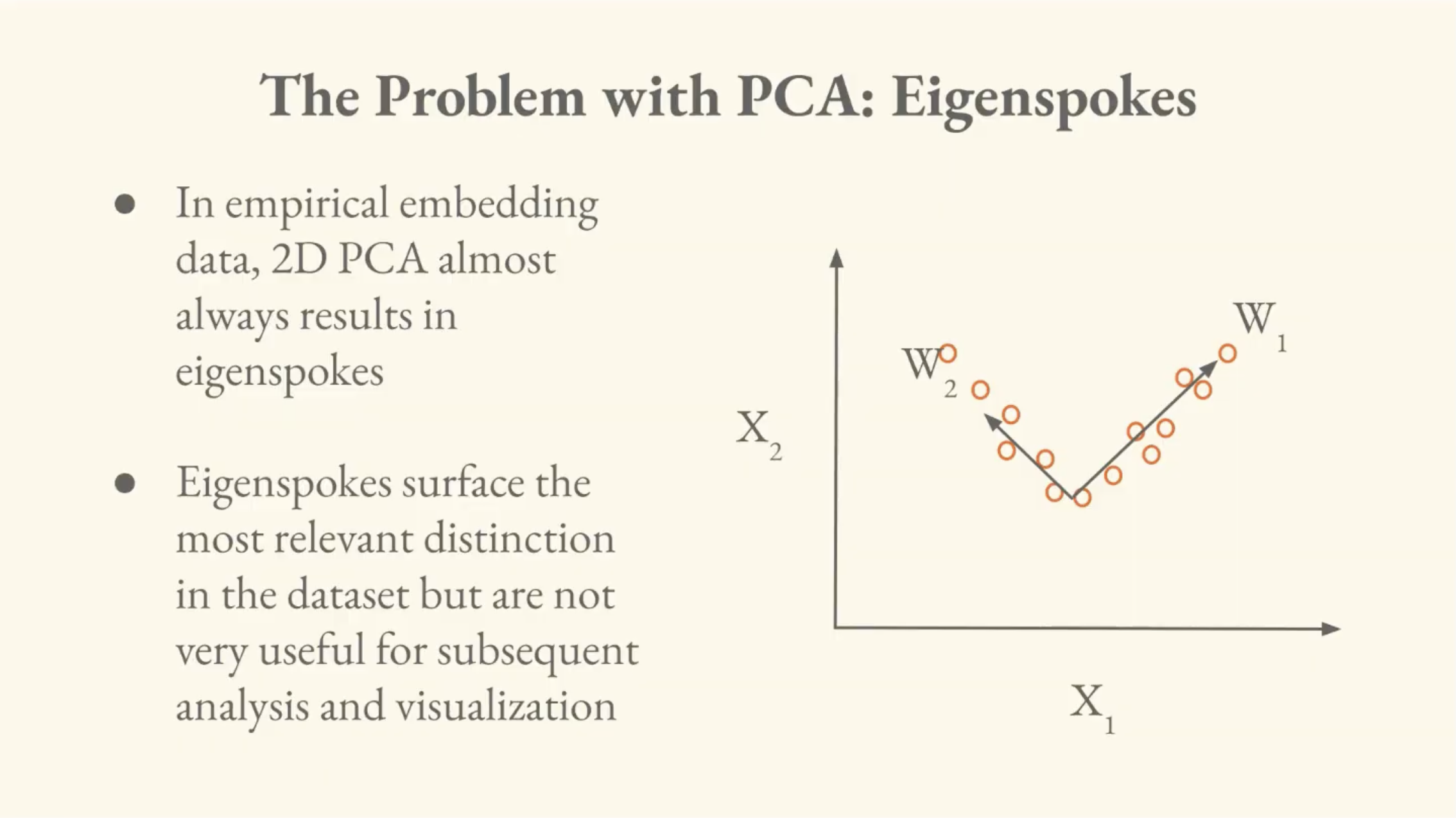
The first two components do surface a distinction in the data, but it's only a single distinction. For visualization, PCA is therefore a dead end.
III. Solution — Non-Linear Projection
The intuition behind non-linear projection is "what if we could look at a bunch of principal components and glue them together in some sensible way?"
Instead of minimizing reconstruction error, we want to match proximity structures. So we find a low-dimensional arrangement of points whose pairwise distances resemble the pairwise distances in high-dimensional space.
Brandon walks through a lineage of methods that all approach this differently. What distinguishes them is how they define their high-dimensional and low-dimensional proximity structures:
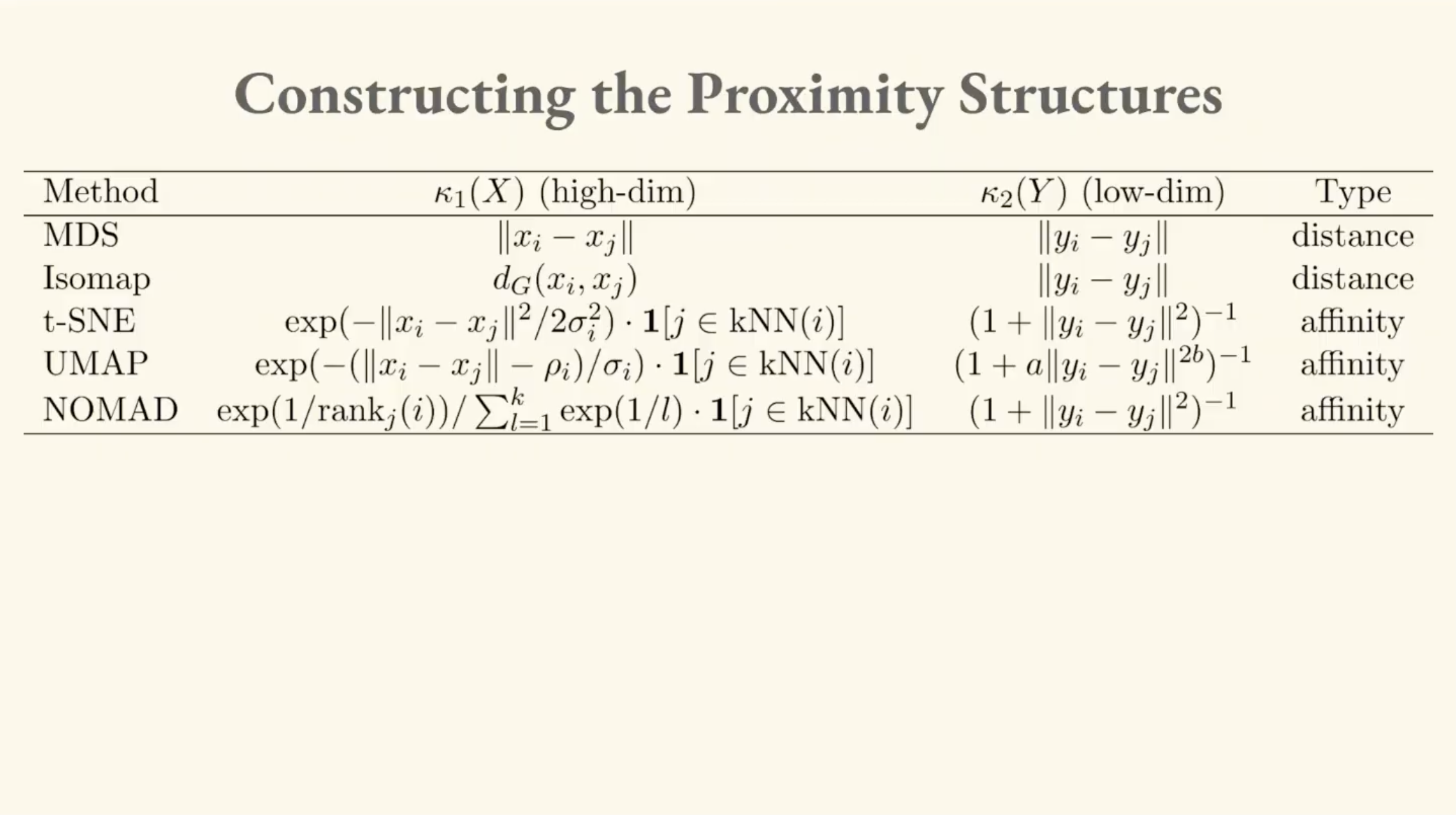
MDS (Multi-Dimensional Scaling)
This is the linear baseline of the non-linear family. MDS minimizes the squared error between high-dimensional and low-dimensional pairwise distances. When those distances are Euclidean and the data is centered, this specific approach (Classical MDS) is equivalent to PCA, which is equivalent to SVD.
Isomap
Isomap is the first genuinely non-linear method, which came out of the Tenenbaum lab at MIT. This addresses the limitation of Euclidean distance, which is that it doesn't respect curvature.
Brandon illustrates this with a surface, invoking an image of a napkin-shaped 2D surface embedded in 3D space, with data points scattered across it. Two points on opposite folds might be very close in Euclidean distance, but they're very far apart if you have to walk along the surface.
Isomap solves this by building a k-nearest-neighbor (kNN) graph on the data and measuring distances along the graph (geodesic distances), rather than through empty space. As the amount of data increases, the graph distances approach the true distances along the curved surface.
The classic case is called the "Swiss roll dataset," a spiral surface in 3D where Euclidean distance is deeply misleading, but graph-based distances capture the actual structure.
t-SNE
t-SNE (t-distributed Stochastic Neighbor Embedding) is an entirely different innovation. In our low-dimensional projections, points tend to crowd together, because they're trying to pack a lot of distance relationships into a smaller space.
t-SNE solves this by using a t-distribution for the low-dimensional distances. The t-distribution has heavier tails than a normal distribution; this means points that are placed farther apart in the low-dimensional space are penalized less, so the visualization spreads out.
The high-dimensional side uses a Gaussian centered at each point, with an adaptive bandwidth, truncated by nearest neighbors, thus continuing the curvature-aware approach from Isomap.
The whole thing is optimized by minimizing the Kullback-Leibler (KL) divergence between the high-dimensional and low-dimensional probability distributions.
A critical efficiency problem here is that the denominator of the low-dimensional probability requires computing distances between every pair of points. The high-dimensional distances only need to be computed once (the data doesn't move), but the low-dimensional positions change at every optimization step. It's an O(n²) operation at every iteration.
UMAP
UMAP (Uniform Manifold Approximation and Projection) arrives from a completely different academic lineage (category theory and differential geometry) rather than machine learning.
It stems from the intuition that you should be able to construct informative local coordinate systems in high-dimensional space, then use category theory to glue them together.
Interestingly, a 2024 paper showed that despite their very different derivations, UMAP and t-SNE learn almost the exact same thing, up to a scaling constant. t-SNE just produces a slightly more spread-out version.
The algorithm described in the UMAP paper and the algorithm implemented in the UMAP code were different. But in practice, the code used a noise contrastive estimation (NCE) approximation (the same technique we discussed in Part Three with InfoNCE) to handle the expensive n-squared denominator. That turned out to be what made UMAP and t-SNE equivalent.
IV. Nomic Projection (NOMAD)
The most recent method Brandon covers is one developed at Nomic, called Negative Or Mean Affinity Discrimination (NOMAD). It brings the innovations from Nomic Embed (which we covered in Part Three) to the dimensionality reduction problem.
-
Use ranks instead of distances. InfoNCE is only consistent for the rank ordering of your data. It gets the ordering right even if it doesn't nail exact distances. NOMAD uses a rank-based kernel. All it cares about is that this point is the closest neighbor, that one is second closest, and so on.
-
Not all negatives are equal. Hard negative mining matters here just as it did in embedding training.
-
Synthetic negatives. When computing the denominator, instead of sampling individual far-away points, NOMAD takes entire distant clusters, computes their mean, and uses that as a single negative. This directly addresses the crippling O(n²) bottleneck that plagues t-SNE.
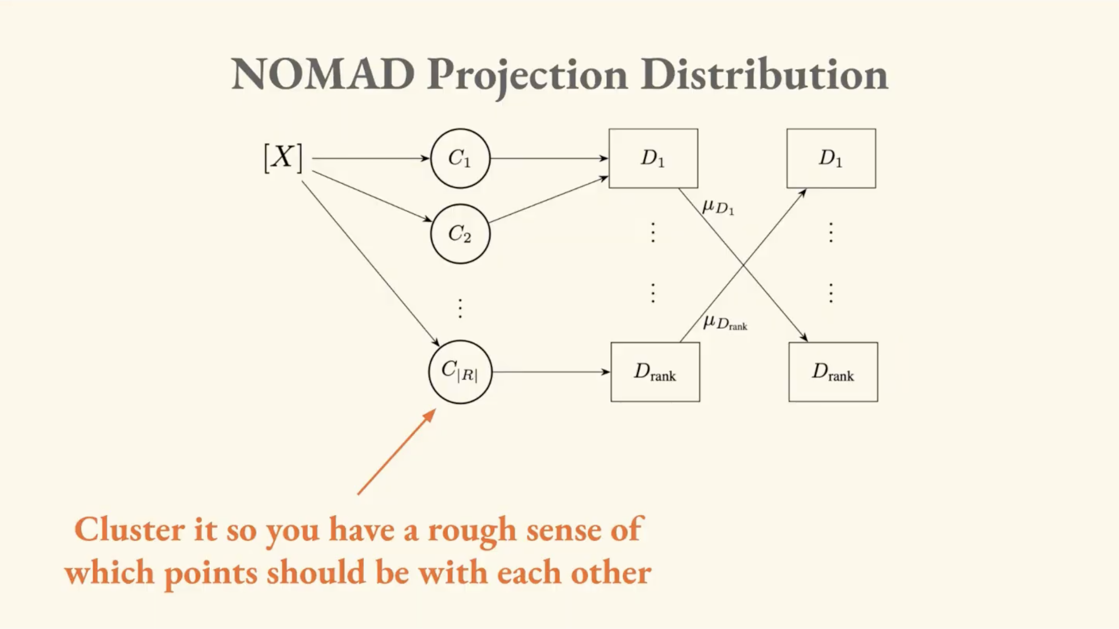
The synthetic negatives trick also solves a distributed computing problem: when your dataset is too large for one GPU, you pre-cluster the data and load different clusters onto different machines. Normally, exchanging information between GPUs is extremely expensive, but with synthetic negatives you only need to send a few mean vectors between machines instead of large tensors of individual points.
It was this methodology that allowed Brandon's team to generate the first complete visualization of all of multilingual Wikipedia, the aforementioned 61 million points. They collaborated with the original t-SNE author on the paper.
V. Reading the Map
Brandon spends significant time on interpretation, which is the most important part of the lecture for making sense of these visualizations (as there are specific pitfalls to be aware of).
Coordinates Are Only Locally Meaningful
These projections group up locally informative coordinate spaces. In one region of the Wikipedia map, you might observe that "up" corresponds to "more animal-like," but that axis doesn't carry over to other parts of the map. "Graphs" does not equal "software plus animal." The vector is local.
Brandon says the most common mistake people make with these maps is taking a locally meaningful vector and trying to apply it globally.
Our physical intuitions about geography will fail us here, because this is a map of a map. In information cartography, North is not consistently North no matter where you're standing. The visualization is a stitched-together illusion of local neighborhoods. So keep in mind that it looks like physical space, but plays by different rules.
The Moon Effect
Distant clusters can shift position across different runs of the projection, and Brandon calls this the moon effect. These peripheral clusters orbit the main mass of data. The relative position of two far-apart clusters is not necessarily stable or meaningful. If you see two distant clusters and want to draw a conclusion about their relationship, you have to go back to the high-dimensional vectors and verify.
Always Verify in the Ambient Space
Brandon returns to the Homer example from the Wikipedia map. When they zoomed into the area around ancient Greek literature, they found clusters of Homer, the Iliad, the Odyssey, but they also found clusters of frog taxonomy articles.
The reason is that the embedding model was treating Greek-sounding frog names as semantically close to Greek literary themes, due to a property where the model weights surface form (what something sounds like) as semantic content. Also: there's a widely translated Wikipedia article called Batrachomyomachia ("The Battle of Frogs and Mice") which is a rewriting of the Iliad with frog characters. That's the cause of the semantic bridge pulling frogs toward Homer.
They verified this by checking cosine similarities in the original 768-dimensional space. It turned out that the Greek frog was closer to Homer than the Iliad was to Homer, in the embedding model's view. This is a real property of the model, not just a projection artifact. It reveals something about how the model defines meaning differently than we do.
"These models inhabit a linguistic and symbolic world that is very different than our own, and it is quite difficult for us to tease out what they believe that things mean, because we bring so much of our own context to the table."
VI. Maps in Action
Brandon shows two more maps to demonstrate the practical value of information cartography.
U.S. Senator Tweets
A dataset of every tweet from every U.S. senator in office from the beginning of Twitter through 2024. When you add a time slider, topics bloom and decay like cultures in a petri dish. COVID explodes around 2021. A labor rights cluster activates shortly after as a lagging indicator of real conditions like mass unemployment, work from home debates, return-to-office policy.
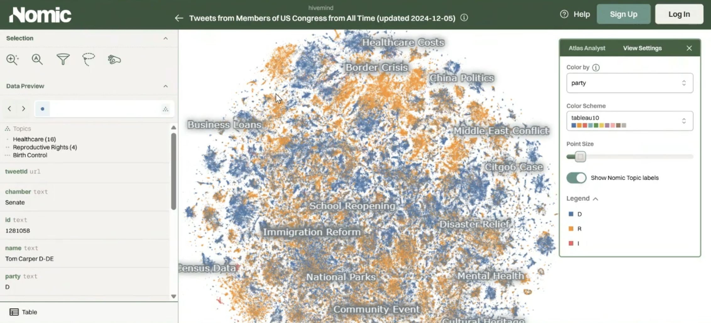
When you color the map by party affiliation, literal party lines become visible as well. In the immigration cluster, the Republican side emphasizes "border security" and "national crisis," while the Democratic side emphasizes "immigration detention" and "immigration policy." The same phenomenon from a different frame. The map makes ideological framing spatial; proximity ends up being a function of political narrative.
Someone in the class pointed out that "border security" appears on both sides of the line. It turns out those are Democrats commenting on Republican border wall proposals. There are many layers of interpretation.
Stable Diffusion / CLIP
Brandon shows a map of AI-generated images, embedded not with a text model but with CLIP (a multimodal model trained contrastively on image-text pairs). In this map, all the generated Elon Musk images cluster together, near Donald Trump images, near Jeff Bezos images. All of those are near images of actual money.
A human face does not visually resemble currency, but because CLIP binds images and text, and because in language there's a strong association between these people and wealth, that association shows up spatially.
If the engineer had chosen a pure vision model instead of a multimodal one, the Elon-money cluster would vanish, because the relationship only exists in language. The tool we use to measure meaning ultimately dictates what meaning is.
This brings me back to the core premise of this series: I argue further that both training and choosing an embedding model are acts of semiotic world-building. When engineers train a model, they are hard-coding specific definitions of meaning. When you choose a model to process your data, you are actively selecting the 'physics' of the world you are trying to map. Everything downstream (what counts as proximity, what counts as distance, or what relationships are even visible) follows from these decisions.
Brandon closes the lecture with the Wittgenstein callback from lecture one:
"If a lion could speak, we would not be able to understand what it says."
Unsettling to consider deeply. These models inhabit a world of meaning that is based on ours but is not ours. Information cartography gives us a way to peek into it, but we have to remember that we're reading a map of a map, and that the cartographer's choices are baked in as well.
In Part Five, we'll look at how these tools apply to tracking the spread and distortion of meaning across networks and over time. After spending four lectures on building the foundational intuitions, we will finally explore the core activity of Computational Semiotics.
So Long,
Marianne